
Project Type
Enterprise Platform Internal Tools Omnichannel Retail UX
Role
UX Designer
Platform
Nykaa Retail POS (Internal, B2B)
Target Users
Brand Managers, Store Managers, Cart Rule Team, Catalog Team, POS Support Group (PSG), Ops & Business Teams
Post launch, the POS platform reduced offer-related errors by ~25%, cut operational overhead by ~1500 hours/year, and improved checkout confidence across retail stores.
Overview
Nykaa’s omnichannel retail operations relied on multiple backend systems to configure offers, but lacked a unified view of what was actually live. This led to mismatched discounts, customer disputes, operational inefficiencies, and revenue loss. The project aimed to design a single, system-backed source of truth for retail offers within Nykaa’s POS to ensure clarity, consistency, and error prevention across teams.
The Problem
Retail offers were managed across disconnected tools- backend systems, spreadsheets, and manual communication between teams. This led to poor visibility for Brand Managers, no easy validation for store staff, lack of real-time updates on offer changes, and frequent mismatches between promised and configured offers.

Current Gaps
-
Can't distinguish current vs upcoming vs expired offers
-
No Inventory Visibility - Store staff can't see stock levels
-
No Status Indicators - No visual cues for offer state
-
Dense Information Architecture - All offer types mixed together
-
Stakeholders miss changes due to lact of notifications
Design Constraints
-
Offers were configured across multiple backend systems
-
POS needed to remain fast and reliable
-
Store staff had limited time and training
-
Editing permissions needed to be tightly controlled
-
Data accuracy was non-negotiable
Design Goals
-
Create a single source of truth for offers
-
Enable real-time visibility for all stakeholders
-
Eliminate dependency on external G-sheets
-
Reduce human error and manual coordination
-
Improve in-store customer experience without slowing staff workflows
The Solution (0->1)
Design Process & Key Decisions
Approach:
The core problem was not a lack of data, but a lack of clarity, confidence, and system-backed visibility.
The redesign focused on replacing fragmented spreadsheets and tribal knowledge with a single, reliable interface inside POS that teams could trust.
The solution was designed around three principles:
-
Time-based clarity: what’s live, what’s next, what’s no longer relevant
-
Operational confidence: knowing whether an offer will actually work at checkout
-
Proactive communication: reducing surprises caused by silent system changes
Timeline Segmentation
Brand Managers and store teams could not distinguish between live, upcoming, or expired offers, leading to incorrect assumptions at checkout.
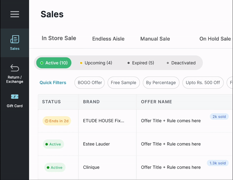
Design Solution:
Introduced tab-based timeline segmentation to reflect the lifecycle of an offer.
Key Design Decisions:
-
Tabs display real-time counts to indicate volume and urgency
-
Color-coded tabs establish instant visual hierarchy
-
Default view opens on Active offers to support store workflows.
Outcome:
Users could instantly answer: “What offers apply right now?” without scanning spreadsheets.
Inventory Integration for SKU-Level Confidence
Offers were often promised for SKUs that were out of stock or low in inventory.

Activity Feed & Change Notifications
Teams were not informed when offers went live, were disabled, or modified, causing last-minute surprises.
Design Solution:
Introduced a real-time Activity Feed panel with notifications and "Share" option within the POS.
Features:
-
Chronological feed of system-triggered events - “Offer X activated, “Price parity enabled for Brand Y”
-
Reduced reliance on emails, WhatsApp, and escalations
Outcome:Shifted the system from reactive troubleshooting to proactive awareness.
Design Solution:
Added a dedicated Stock Status column aligned with each offer.
Features:
-
Visual indicators:
-
✅ In Stock
-
⚠️ Low Stock
-
❌ Out of Stock
-
Outcome:
Store staff could validate both offer applicability and availability before engaging the customer.
Enhanced Filtering & Discoverability
Users relied on manual filtering in spreadsheets to answer basic questions like “Which offers are live this weekend?”
Design Solution:
Added advanced, role-appropriate filters directly into the interface.
Filters included:
-
Date range picker ( “Active between X-Y”)
-
Source system filter (Magento / NRM / Catalog)
-
Brand multi-select with search
Outcome:
Enabled self-serve exploration and eliminated spreadsheet dependency.
Key Features Designed & Implemented
-
Status-based tabs with real-time counts
-
Inventory visibility at SKU level
-
Activity feed with system-driven notifications
-
Color-coded lifecycle badges
-
Source tracking across backend systems
-
Export tools replacing spreadsheets
-
Quick actions for verification and monitoring
Outcome & Impact
While exact metrics are confidential (other than reduced offer-related errors by ~25%, cut operational overhead by ~1500 hours/year), the redesign led to:
-
Significant reduction in offer-related store escalations
-
Lower dependency on POS Support Group
-
Reduced manual coordination between teams
-
Faster and more confident checkout experiences
-
Improved customer trust and store satisfaction
Most importantly, retail teams stopped operating on assumptions.
What This Project Demonstrates
-
Enterprise UX is about system clarity, not visual polish
-
Error prevention has higher ROI than error recovery
-
Internal tools directly impact customer experience
-
Good UX aligns business intent with system behavior
Final Reflection
This project reinforced a core belief in my design practice:
When systems are unclear, humans absorb the cost.
Good UX moves that burden back to the system.
By creating a single source of truth for retail offers, the POS became not just a billing interface, but a reliable foundation for decision-making at scale.