
📊 Quick Look : Project IMPACT
+48%
ATC CTR
from Reviews page
post revamp
+30%
ATC Uplift
as on Android
+42%
CTR (Android)
+27%
CTR (iOS)
For AI-Recommended Key Phrase Filters
+500bps
CTR uplift
improvement for
High-Intent Users
The Revamp: WHY?
Revamping the ratings and reviews section of Nykaa is a strategic move focused on improving the overall user experience and ensuring ongoing platform relevance. Key reasons for this initiative include creating a user-centric design aligned with evolving expectations, introducing new information or enhancements for clearer presentation, optimizing the user journey through improved layout, enhancing trust and credibility by updating and polishing features, gaining a competitive edge in a dynamic market, adapting to technological advances, utilizing user feedback actively, and leveraging a refreshed section as a marketing tool for user acquisition and positive brand perception.
Understanding User Problems and Analyzing the Current Page Performance-
"The goal of the UX revamp was to make the information on ‘All reviews page’ easily consumable for the customers such that they can make quicker buying decisions."
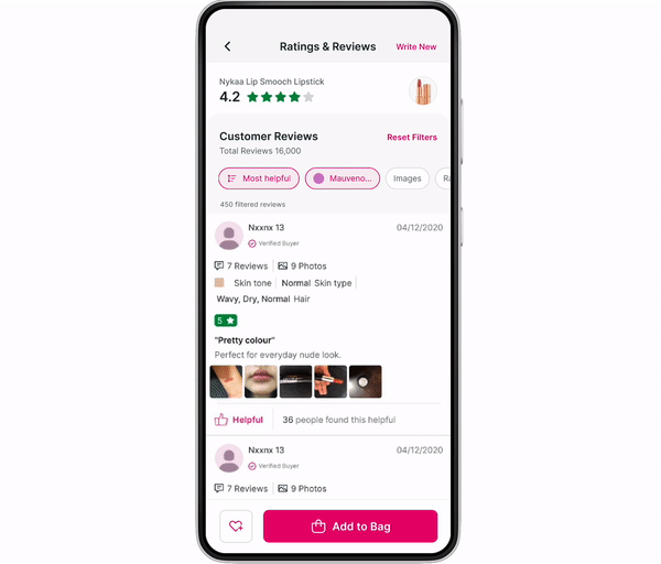
Data and feedback show that the All Reviews page feels cluttered, mainly due to redundant or low-use filters and confusing sorting options. Popular filters like shade (~40%), images (5–8%), and 1-star rating (15%) are buried among less-used ones such as Beauty Traits (0.67%), My Beauty Portfolio (0.15%), and the now-redundant Verified Buyer. Filters are also used 10x more than sorting, yet they don’t get clear priority. The similarity between “Most Helpful” and “Most Useful” adds to user confusion.

Actionables:
-
Prioritize high-use filters: shade, images, and 1-star ratings.
-
Deprioritize/remove redundant filters (Verified Buyer, Beauty Traits, My Beauty Portfolio).
-
Clarify or merge “Most Helpful” and “Most Useful.”
-
Keep product visible on RnR (Ratings & Review) page for quick connection and shareability.
-
Communicate product rating + breakdown clearly with a scalable design.
-
Add a summary section (rating distribution) for quick insights, similar to web view.
Evaluation Strategy
Qualitative Goals
-
Influence on buying decisions: Understand how reviews shape user purchase confidence.
-
Scope of exploration: Capture how deeply users engage with reviews and filtering options.
-
Transparency of information: Ensure reviews are perceived as clear, unbiased, and easy to digest.
-
Ease of comparison: Simplify the process of comparing experiences across filters such as shade or rating.
Quantitative Goals
-
Engagement: CTR, time spent on All Reviews, and interactions with key phrases.
-
Conversion: Add to Cart (ATC) and order completion influenced by review interactions.
-
Exploration paths: User journeys from PDP → All Reviews → ATC/Wishlist → Order.
-
Behavioral metrics: Percentage of visitors using filters/sorting options and bounce rates.
Key Metrics Tracked
-
Conversion Funnel
-
PDP visits → All Reviews visits → Add to Bag (from All Reviews + PDP after review visit) → Order.
-
PDP visits → All Reviews visits → Wishlist (from All Reviews + PDP after review visit) → Order.
-
Filter & Sort Usage
-
Percentage of users applying filters or sorting options on All Reviews.
-
Identification of most-used vs. redundant options.
-
Engagement & Drop-Off
-
Bounce rate on All Reviews.
-
Time spent and interactions with features such as the key phrases section.
-
Product Rating Segmentation
-
Group products by rating distribution: 4.5, 4 – 4.5, 3 – 4, <3
-
Track number of low ratings (<3) across thresholds: 0, 1–4, 5–9, 10+.
Cross-Functional Collaboration
Meet the team!
Post the timeline discussion with the Product Manager, I laid down my design process the timeline and planned deliverables accordingly. Working on a project with a dedicated and cohesive team can be a transformative experience. In this project, I had the privilege of working with an exceptional group of individuals who not only brought diverse skills to the table but also fostered a collaborative and supportive environment.

The Journey we navigated...
Just as the saying goes, “Rome wasn’t built in a day,” the final design of the RnR page also took longer than anticipated. Despite its seemingly straightforward nature, multiple iterations were necessary to determine the optimal user experience. This extensive process was crucial to ensure swift switches and effective comparisons for the users.
Let’s get through some of the important iteration phases out of many to understand the swift in design direction ;
Step -1 : The Concept: Wireframes
Wire-framing my ideas in order to give the page a structure and begin with a hierarchy which is inline with the brief!

Step - 2 : Exploring...
After some quick sketches of the overall rough layout of the page, I started with some initial UI designs and give the page some character in terms of visual elements to set a direction.


and Trade-Offs
(Refining the concept...)
Step -3 : Creating a Prototype, align teams and Handsoff
Once the design was final from my end, a prototype was presented to discuss it with all teams including Product, Business and Tech to ensure the possibility of this design before hands-off and took an overall alignment from all teams.

Click on the link below to view the prototype of the revamped RnR page in better clarity👇
https://drive.google.com/file/d/1rJDRNE8cblXjQKZxcG75CHtTalsix5MQ/view?usp=drive_link
🔎 Addition of AI Recommendations - Filter by Key Phrases!
Ratings and Reviews strongly influence purchase decisions. Nykaa leads in beauty product RnR with ~1000 reviews per product, often detailed and helpful. However, beyond ~30 reviews, additional ones add little value—only the total count signals credibility. Hence, the focus should shift from collecting more reviews to ensuring higher-quality ones.
Problem Statement
Customers sift through an average of 1000 reviews for top-selling products, seeking validation for product claims. The Review and Ratings (RnR) system aims to bridge the gap between promised attributes and actual delivery. Currently, this evaluation relies on subjective perceptions shaped by the reviews encountered, potentially leading to misjudgments. The goal is to provide a more quantifiable measure of the alignment between brand promises and customer experiences.
Once the design was final from my end, a prototype was presented to discuss it with all teams including Product, Business and Tech to ensure the possibility of this design before hands-off and took an overall alignment from all teams.
Solution:
-
Create review-based filters by extracting the top 5–10 recurring phrases (≤3 words, ≥10 mentions, excluding brand names).
-
Useful buckets include skin tone, concerns, hair attributes, and product traits.
-
Using AI integration to analyze reviews to identify and surface these key topics as filters.

🎉 Conclusion and way forward!
This redesign focused on improving the layout and hierarchy of the Ratings and Reviews page, highlighting overall ratings, summaries, and product details. The section was divided into ratings and reviews to optimize screen space and emphasize core content. Next, we’ll refine the review card presentation. Stay tuned for updates and enjoy exploring insightful reviews on Nykaa!